Let’s face it: When it comes to converting ice-cold traffic into leads, subscribers, or sales, you will have a HARD time.
Well, you can change all that.
With a couple of tweaks here and there, you can easily increase your landing page conversion rate up to 80%.
Bold promise? Of course.
In today’s post I’m going to share with you 15 copywriting hacks that will help you do just that. Are you ready?
1. Use these techniques to create more compelling headlines
Listen: Headlines are extremely important.
According to Copyblogger, 8 out of 10 people will read your headline, but only 2 out of 10 will read the rest of your copy.
Incredible, right? But it’s true.
The bottom line is that if you want to increase your landing page conversions, you MUST spend enough time writing your headline. But don’t worry, it’s not that hard. If you follow the techniques below, you’ll be fine:
a. Use Specific Statistics And Numbers
If you want to add more credibility to your landing page’s headline, you should consider adding stats and specific figures to it
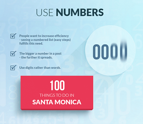
For example, “13,000 users are happy with our product” is much more compelling than “our users are happy with our product”.
Empower Network did an excellent job using this technique on their home page:

They added EXACTLY how many users they have, and that simple statement makes the headline more powerful and engaging.
Try to find specific stats and figures your company has and add them to your headlines. That way, your visitors will feel more comfortable about doing business with you.
b. Evoke Emotion
Whether you’re selling digital products, physical products, or even software technology, emotions definitely sell.
According to a study conducted by Copyblogger, if you apply the right emotions to your copy, your sales are boosted dramatically.
Let’s look at an example:
JCD repair is a solution for people who want to fix their iPhone screen. It’s actually quite nice, since you can book these guys directly through their website.
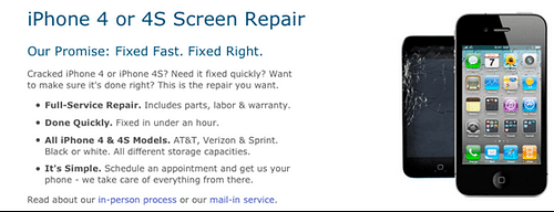
They decided to perform a test on their home page’s copy to see if they could improve conversions.
Here’s the old home page:
After testing a few more versions, they finally came up with this one:
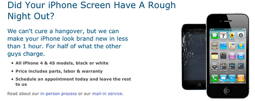
As you can see, the new version is more emotional and can even make you smile.
Results? 18% increase in appointments.
That’s the power of emotional copy.
If you want to test how emotional your headline is, you can use this free tool.
c. Use the Same Language Your Customers Use
According to Conversionista, when your goals and your users’ goals meet, increasing your conversion rate becomes an easy task. However, in order to do that you need to understand your audience first. That way, you can write the EXACT words they use to describe their problems.
Take a look at the following example:
Brian Dean conducted a study to figure out the problems of his main audience. They stalked some SEO forums and Quora to look for questions people asked over and over again.
What Brian found was plain awesome:
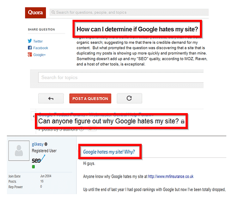
A lot of people were trying to figure out why Google hates their websites.
After finding that information, Brian created a post called “Why Google hates your website”
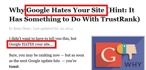
That post was extremely popular and still ranks #2 for the keyword: “Trustrank”.
I know, I know. This post is about landing page conversion optimization, but you can actually convert much more visitors into leads if you speak the same language they speak.
Take this information into account when creating your landing pages.
To find the exact words your audience uses, you can stalk forums, set up user questionnaires, or survey your email subscribers.
2. These “small” tweaks can dramatically improve your CTAs
You’ll agree with the following statement: It’s REALLY complicated to make people click on your call-to-action.
Or is it?
However, there are people who have dramatically increased their click-throughs by adding a couple of tweaks here and there to their CTAs.
Here’s an example of how changing the possessive determiner from, “My” to, “Your” decreased conversion by 24.91% on a forum payment page.

Want to know the best part?
YOU can get similar results. Just choose one of the following tips and use it. I’m sure you’ll notice that more people have begun to click on your CTAs.
a. Use Weird Calls-to-Action
Many case studies revealed that “weird” calls-to-action convert much better than the common “buy now” or “sign up now”.
For example, instead of using the conventional “Sign-up now”, Shopify.com has a better call-to-action:

Another example is Unbounce. They created a more compelling call-to-action by writing: “Build a high-converting landing page now”:
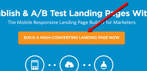
Try to be more creative with your CTAs and you’ll see an increase in your conversions.
b. Ask For Micro-Commitments
If you’re on a first date, you would definitely not propose marriage.

The same psychology applies to marketing. You can’t ask for big commitments on the first visit (in most cases, at any rate).
So what’s the best way to overcome this problem?
Ask for micro-commitments.
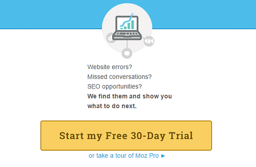
For example, instead of asking people to buy your products, you can offer a 30-day free trial. That way, your visitors will be able to make a more informed decision.
Also, they will feel that are making a smaller commitment.
3. Show prices to double lead generation
SafeSoft ran an experiment, a few years ago. They tested whether displaying the price on their landing page increased or decreased conversions.
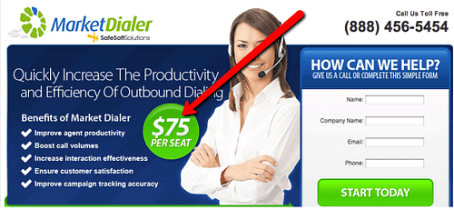
Want to know the results?
They DOUBLED their conversion rate.
You’re probably wondering:
Can I achieve similar results?
Well, you can. However, there are some things you need to consider before displaying prices.
Here’s how to do it the right way:
a. Time As Major Benefit
Jennifer Aaker, professor of marketing at Stanford Graduate School of Business, discovered that people can perceive more value when you use time as a major benefit.
Bidsketch (a software that helps working professionals create awesome proposals) uses this technique very well:

As you can see, the perceived benefit of their value-proposition is higher when they add “in minutes”.
Also, they added a testimonial where a client was able to cut down their proposal time “from 3 hours to 45 minutes”.
That simple statement dramatically improved their UVP.
b. Avoid Option Overload
CONSUMERS CONSTANTLY FACE “ANALYSIS PARALYSIS, WHERE TOO MANY OPTIONS ACTUALLY RESULT IN NO DECISION BEING MADE”. - Oli Gardner, co-founder at Unbounce
The statement above is completely TRUE.
As a matter of fact, BaseKit (a popular website builder), conducted an experiment a few years ago. They were trying to figure out how many people visited their “buy now page” after visiting their “Pricing page”.
Here’s the original version:
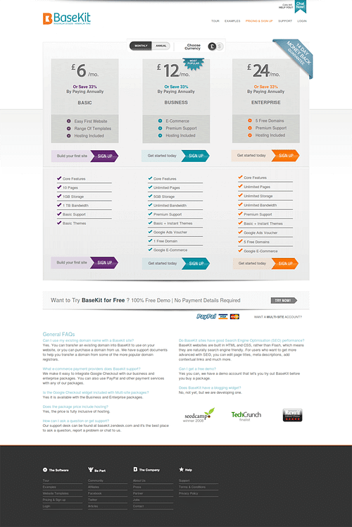
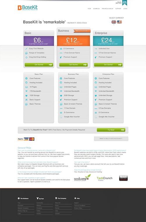
They made a few modifications that resulted in a 25% increase in conversions. For instance, they replaced the old color with brighter colors. Also, they added clearer pricing and simplified the options. Here’s the redesigned version:
Key Takeaways
Try to add just 3-4 options, instead of 5-8. That way, people will find it easier to choose the right one. But do make it easier for people to see the value they receive after purchase.
4. Get rid of points of friction
You probably think your landing page looks awesome.
Well, you’re not alone. UK Tool Centre thought the same way....
They had an extra filter on their page that helped visitors search for woodcare products.
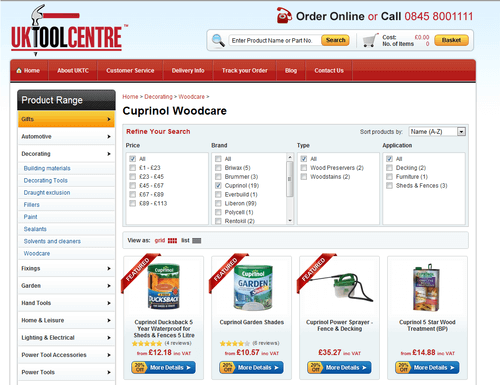
However, they realized that their “awesome” extra product filter was reducing engagement and conversions...
When they removed the filter, conversions increased by 27%.
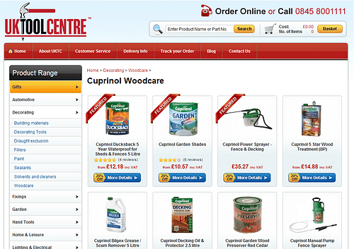
Awesome, right?
The best part is that you can also improve conversions if you remove distractions that are causing people to leave without buying your products, sign-up, or even subscribing to your newsletter.
Here’s how.
a. Remove Social Icons
If you want people to subscribe (or buy) to your products, make it easy for them. Adding social icons to your landing page will only distract them.
Need proof?
Taloon.com (a Finland-based hardware eCommerce store that sells plumbing) wanted to increase the number of people who click their “add to cart” button.
This is how the page looked:
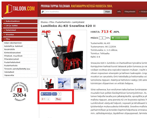
They decided to remove social sharing buttons, and the results were amazing. Take a look at the new version:
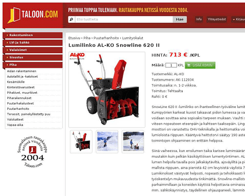
They increased click-throughs by 11.9%
The bottom line?
In most cases, social sharing buttons only distract people from your call-to-action.
b. Remove distractors
Earlier, we mentioned that the UK Tool Center removed a product filter they thought was useful, but once they removed this, their conversions went through the roof.
Try to look for things that might be distracting your visitors from your main goal and remove them.
The best ways to find points of friction are A/B testing and heat mapping:
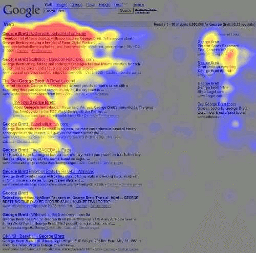
5. Develop a unique and clear value proposition
Nowadays, it's really hard to create something 100% new. It used to be easy, but industries are more competitive today than they were years ago.
So, how do you stand out from the crowd?
Really simple. With a clear and unique value proposition.
A value proposition is a statement that clearly shows your visitors WHY you’re better than (or different from) your competitors.
I’m not going to show you how to create one because there is so much information about the topic out there.
Instead, I’ll share with you 3 hacks to boost the power of your UVP. Here they are:
a. Loss Aversion
Several studies have demonstrated that people feel more motivated to avoid a loss than to win something.
Incredible, but it’s true.
In other words, you can create more compelling value propositions by writing things like “Don’t lose more money” instead of “Save more money”.
Adding such copy into your UVP can improve your conversions.
For instance, DCfinder increased CTR by 68% using loss aversion on their landing page.
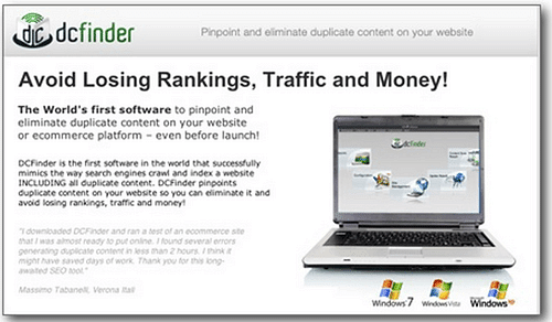
This technique might not work for everyone. It really depends on your niche and your audience, so the best thing you can do is to test.
b. Let Someone Else Speak For You
Can you guess who the best person to describe your product is?
If you think you are that person, think again.
People who have used your product to solve their problems are best suited to describe it. In other words, testimonials are the most powerful value propositions you can use.
Let’s use Bidsketch as an example, again:

If you pay close attention to that specific line, you’ll find that it was written by a happy customer.
6. Tell stories to connect with your visitors and increase conversions
Do you know why movies and novels are so popular?
Because they’re extremely good at telling stories.
Yes, people LOVE stories.
And when it comes to marketing, you can apply the same psychology. In fact, Proclamation Jewelry was able to even TRIPLE their sales in one year after they started to use storytelling.
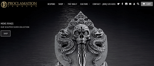
HUGE, right?
That’s why you should start telling stories on your landing pages.
Here are some guides that will help you do it right:
7. Use Twitter testimonials to boost newsletter sign-ups
I’m sure you’ve a twitter account (if not, go ahead and create one).
And you probably have a sign-up form on your website as well.
What if I tell you that you can leverage the power of Twitter to create powerful sign-up boosters?
Because you can.
Take a look at the following example:
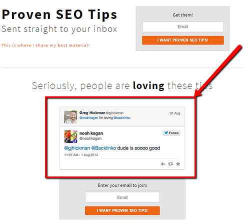
Brian Dean was able to increase credibility just by incorporating these twitter comments to the page.
Simple, but effective.
8. Use psycho-boosters to entice visitors to take action
Neil Patel made the following statement in a Crazy Egg post, last year:
“Buyers do what their instincts tell them to do — to act immediately on what is important (urgency), and to acquire what is limited (scarcity).“
That’s completely TRUE.
For example, KISSmetrics saw a dramatic boost of 102% on their conversions after reducing their free trial from 30 days to 14 days.
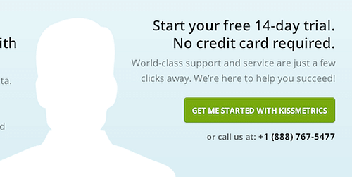
What’s the bottom line?
Scarcity works!
And you can easily use it to increase your landing page conversions.
Here’s how:
a. Action Triggers
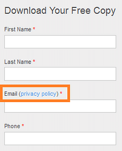
Action triggers or click triggers (as Joanna Wiebe calls them), are psychological bits of copy that make people feel more comfortable about following your CTA.
Privacy statements and money-back guarantees are good examples of click triggers. If you incorporate these things into your landing page, you’ll actually boost conversions.
b. Use Scarcity
Everyone and their mom knows scarcity works like mad. Marketers have used this persuasion technique for decades for that simple reason.
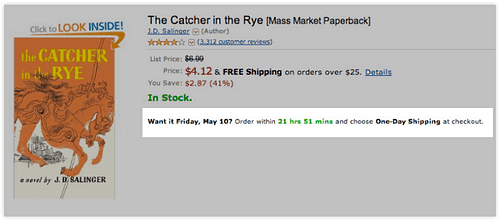
For example, adding phrases like “4 seats left” or “Price will increase in 2 days” can dramatically increase the number of visitors that actually convert into a lead.
Amazon usually do an incredible job using this technique:
c. Use Risk Reversals
People HATE risks.
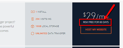
Especially when money is involved in the equation, and incorporating guarantees into your landing page’s copy can demonstrate people that they can trust you.
That there is nothing to lose.
9. Make copy sexier for your visitors
Listen: You can add lots of useful information to your landing page, and it would be great.
But do you know what’s better?
Strategically organize your information.
That makes your landing page sexier, and people would be more likely to actually read your entire copy (and understand your message).
Here are two ways to do it:
a. Bucket Brigades
This term was coined by Brian Dean.
Basically, Bucket brigades are words and phrases that entice people to read the next sentence. In fact, I’ve used them a lot in this blog post:

See?
And when it comes to landing pages, it works, too. Try to incorporate some of them in your next landing page and you’ll see how more people read your entire message.
b. Simplicity
Keep it simple.
According to Adpushup.com, a 96% increase in customer loyalty and 86% increase in likelihood to buy was observed after simplifying the landing page copy.
Don’t make things harder than they should be.
10. Use video to increase your conversions up to 80%
Bold promise?
Absolutely,
According to Eye View Digital, you can increase your conversions up to 80 percent by adding a video to your landing page.
Here’s how:
Tell Your Product’s story
If you look at the majority of landing page videos, the focus is mostly upon describing features of the product itself, but very few focus on telling the story behind the product.
Remember the rule that storytelling is powerful?
Well, video is the best way to tell your product’s story (especially on landing pages).
Here’s an awesome example of this technique in action: https://m.youtube.com/watch?v=2yKv45X_OIo
11. Use proven objection blockers to build credibility
When people arrive at your landing page, they’ll commonly ask some questions:
- I don’t know you, how can I trust you?
- I don't have time to read this page.
- Maybe another product would be more helpful to me.
- How can I know if other people have used this product before?
That’s why 61% of customers read online reviews before making a purchase.
So, how can you overcome these objections?
Adding proven objection blockers within your landing page.
Here are the best:
a. Social Proof
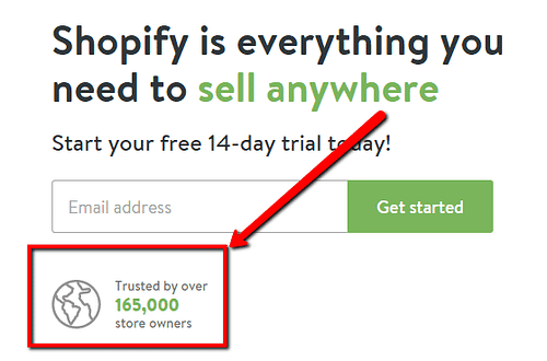
Your visitors are more likely to convert if they see that other people already took action. So, why not show them how many subscribers your newsletter has or how many people have bought your product?
That way, they will trust you.
Here’s an awesome example of Help Scout’s newsletter sign-up form:

Shopify's home page is a great example too:
b. Testimonials
Testimonials are powerful!
What better way to communicate to your prospects that other people LOVE your product?
For example, Neil Patel was able to DOUBLE conversion rates after sharing testimonials from big brands they helped.
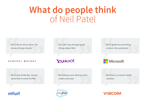
Ask your customers for testimonials and incorporate them into your landing page.
Believe me, it will be worth it.
12. Use these words to convert more visitors into leads
I’ll tell you something awful:
Most people will only read 20% of your landing page copy.
REALLY sad.
But do you know that there are some words that convert better than others?
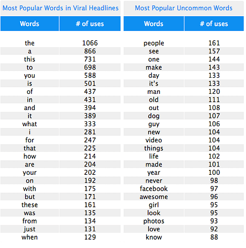
And if you use them wisely, you can dramatically increase the number of people who actually read your entire message.
Here’s how:
a. Use The Word You
Do you know that “You” is the most powerful word in the English language?
Like it or not, as human beings, we’re egocentric, and when your landing page copy is directly focused on your audience, you’ll create an emotional connection immediately.

b. Add The Word Because
No matter the goal -whether you want people to subscribe to your newsletter, buy your products or pay a monthly membership- if you give people a good and CLEAR reason to do it, they will be more likely to actually do it.
Adding the word “because” can help you do that.
c. Use “Here’s How”
If you show people exactly HOW you’ll help them solve their problems, chances are they will want to buy.
For example, let’s say you’re selling a software that helps accountants automate tedious processes.
You could write something like:
“We help accountants save time and get more customers. Here’s how:”
And then you explain all the benefits and features your software possesses.
That single phrase will increase the perceived value of your software. People will feel you’re helping them.
13. Give your visitors some love with extra gifts
Everyone (included me) LOVES gifts, and your visitors are no exception.
Dr. Jerry Burger found that people are more likely to buy from you if you offer an extra “something” for free. For example, you would be more likely to buy a Burger if that came with free potatoes and a soda.
When it comes to boosting landing pages conversion, you can apply the same psychology.
For instance, take a look at the following landing page:
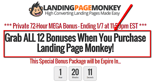
They offer a special bonus when you buy their product.
14. Support your copy with the right image
You probably know the following quote:
“A good image is worth a thousand words”
And it’s true. Sometimes, you can add more value to your landing page copy by including the right image.
In fact, it’s proven that visual content can improve your landing page conversions since 67% of consumers consider images to carry more weight than product information.
However, when it comes to landing pages, you can’t simply add a random image. Here are some recommendations you should follow:
a. Use Images that support your value proposition
Hawk host conducted an experiment.
They replaced their home page image (a globe) with a padlock.
Here’s the original home page:

Here’s the new one:
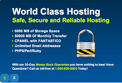
Want to know the results?
They TRIPLED their conversions.
Why? Because the padlock supports their value proposition. The new image communicate a message of security and make visitors feel safe.
The bottom line?
Add only images that clearly support your value proposition.
b. Add Pictures of Real People
It’s proven that pictures of real people work extremely well at increasing your conversion rate.
For example, 37signals replaced their main product page’s background (white) with a picture of a real customer. As a result, they increased sign-ups by 102.5 percent.
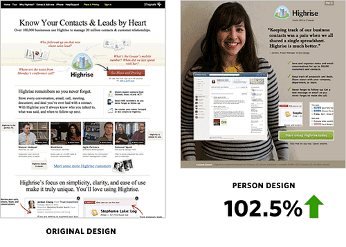
A picture of a real person can make your visitors feel more comfortable and make them want to learn more about your company and products.
15. Cull useless words
Return on time invested (ROTI), is one of the first things you should focus on when creating your landing page. That way, whether people take action or not, they’ll feel that the time spent on your page was worth it.
That’s why you should spend time cutting out unnecessary stuff and useless information from your landing page.
For example, plague words. These are words that add no extra value to your content. Instead of writing “ask a question”, you should write only “ask”, because those words only waste time.
Make sense?
Take a look at the following quotes:
“We provide the best software technology to help businesses increase ROI by learning more about their main audience”
“We help businesses learn more about their main audience and increase ROI”
Which is better?
The second one, right?
Take it into account when writing your landing page’s copy.
Your Turn!
Now that you know how to create landing pages that convert better, it’s time to put these techniques into practice!
Just remember, don’t try to apply all of them at the same time. Grab 2-3 and move forward. Wait a few days and analyze results.
You want to move slowly. That way, you’ll be able to know which changes performed well and which did not.
Deal?
Which other copywriting hacks do you know to increase landing page conversions?
